Today I'm back with some renderings I created of Wine Labels.
I am in the process of making 2 ... a Traditional/Elegant label and a 'Sexy' label. So far I created the image for my sexy label, as I knew this one would take longer, for me. We are to put Text and an image on the label, so the 'sexy' text I chose was the word Sensual. I knew I wanted something soft, so started out with an image I drew of a girl with long flowy hair, with her 'front' showing a little. I then thought about it some more and realized I wanted her to a have a cloth draping over her and her back side showing more, so I sketched out a new image of the original girl, with her features in better proportion with the rest of her body.
I then proceeded to paint using water colour so that I got a softer looking effect in the end.
I also chose to add the colour and a bit of gradient to the cloth to help with the effect I would add later which would be the 'ripples' of the cloth for a more real life technique.
Next, with pencil crayon, I added all the shading to the face, eyelashes, eye colour, etc. Fixed up areas that needed more attention to detail and fix up shapes that might've gotten a bit messed up during the painting process.
Once I scanned the image onto my computer, i brought it into photoshop. I wanted that rough, painted feel to it, so I didn't edit to much, just some parts in her hair, arms and back. I also then added a gradient to the front to soften it up, as the word I used for inspiration is sensual
The last step was adding the word, I wanted the colour and font to be something romantic, warm, but also give a soft look to the label. I chose the same pink as her lips and cursive writing to give the label the look I wanted. I then turned the word on it's side to mimic the girl's vertical stance.
This is how my final ended up.
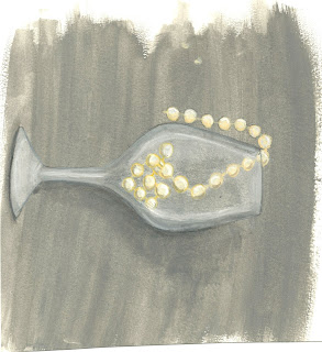
For the Traditional I have started the painting process, I chose to portray a very elegant feel for this design. I chose to paint an empty wine glass, filled with a string of pearls and the other end dangling outside of the glass. I chose a grey a background and even created a drop shadow to look more 3D.
This is the scanned painting, after it finished drying. I then brought it into photoshop, scaled it to my liking and brightened it as well as removing some of the yellow tones out of it-for a fresher brighter look.
This is the final look. There are no words on it, as we were just to create the picture. I used elegance as my inspiration and think it turned out well. As you see, the greys are now darker, the cup looks 'crisper' and the pearls are whiter instead of yellow. I'm happy with the painted look as it's the technique I was going for and am pleased with how the entire label turned out.
Thanks
Veronica K


I LOVE IT!
ReplyDelete