Sunday, April 15, 2012

New. Mind. Set

Hi all,

So we had a project for New Mind Sets for the school (NMS).
We got into small groups and each worked on our own media for the 'client.'
We had to create concepts for a new way of learning.  You could pick which 'options' you wanted and in the end it would blend those things together for 1 program design specifically for you.
I started off with a a blender theme, and the food (options) you put in were the options you pick.  It then blends everything together and pours into a cup.  That cup would be your perfect program.

After some client feedback, I realized it should be more 'school' theme and online.  So I chose to use a book with a mouse to help create the online school theme.
This was my new concept. 

Here is the story board, explaining and showing you how it all works.


We then had to create a logo each, a letter head and business card.


Here are samplings of my Logo, letterhead and business card.
This is the letterhead I made.
I wanted to keep it simple yet still have bold characteristics to it.  I kept the logo big so that it stands out, then added a background so it tied everything together and didn't make it feel like the logo was just sitting in white space.  To keep with the logo, i also made a smaller circle in the corner where you can put information in, or a key point.  You can also choose to do so at the bottom like I did.

This is the business card, I wanted to keep the theme unified and decided to go with the waves of white.  I kept it clean and simple and you can also put info on the back.

This was my experimentation of logos.  I wanted to make something that still had the logo colours of the school, but something that showed the 'nuggets' and blended learning theme to it aswell. 

Overall, after looking and experimenting, this was my finished logo and the one I ended up choosing.

Both of my other group members have different concepts, logos and letterheads/business cards, but this was my take on that.

Thanks again for checking out my blog.
Come back soon
Veronica


Tuesday, April 10, 2012

b contemporary-The Interview


Hi all,
This week we took a field trip *insert Magic School Bus* ...

We were asked to walk around Hamilton and find someone interesting to interview.
Several of us decided to go to b contemporary - Fine Art and Custom Picture Framing.  We spoke with David Brace, whom is the owner of this shop.    We asked to interview him and he kindly agreed...


We just wanted to know what made you get into the industry?

He explained to us that it was just a natural step to him, as he started out as a fine art student, and being a painter.  He started working with artists directly.


How long have you been doing this for then?

 Since 1990, this gallery is a year old, previous gallery for 10 years, part of the art gallery of hamilton, and bouncing around all over the place.


What age did you get interested into this?

David started to get interested in art when he was about 12 or 13 years of age.  Started pursuing it more seriously by taking courses in highschool at around 14-15 years of age.  Only applied for art schools, he ended up going to Queens, but applied to oca, guelph..etc. 


Why do you have your business in Hamilton?

Lots of reasons: I grew up here, I like thats it's an emerging culture, it has percolated in the last 10 years or so, just the right place at right time... lots of really good artists, lots of good interest now.


Do you get a good amount of Traffic here?

A fair bit, yea … the street is changing a lot, especially on weekends I get more people.


How do u choose your art work/ the art that you put into your gallery?

Artists that go back 20 years that he's known, he calls upon them..

"Andy (Warhol) whom goes  back to late 70's , he's been showing for a long time"… David's been asked to show Andy's work … he's ben sent art through mail, e-mail all over the place .. if he's interested, he pursues,   then he talks to the artist-basically gets to know them and knows if they have a good connection then,  takes the next step by booking shows.  


Your artwork is very interesting, is there a specific genre that you call it?

David: Andy comes off as a pop art background.   He has several 12 yr+ pieces in his gallery. Andy's portraits show Young people in the emerging scene.   He was kind of part of that scene... and the guys from 'Chromosome'  in the 80's.  General Idea, was 3 guys who made art,  put on wacky fashion shows, and were media hounds.  So Andy documented things, 
Came to mac to teach, showed his students, they loved it and he started documenting some of the people he's seen.

He showed us several artworks of Andy's and they are simply amazing... 


It seems like he's implemented a lot of photography into his works?

David: Andy's always worked using photography - he'd make silk screens ..burn silk screen a silk screen from photograph, and then hand paint and then, pull ink through the screen.
He'd take photograph, layer it with whatever graphic he wants... takes his drawings and take transparencies...  

Basically a lot more digital now...photoshop is the next big tool.


How much do these pieces, on average sell for?
David: Depends on the artist...
Andy is a senior artist who is approaching 60 now..  He's nationally known, and established clientele     

He showed us some pieces from Andy and said, "$3000 for One Ops" -originals  $4500."  


If someones interested in buying his works, do they know to come here?

They do whatever they can to get the word out.. Andy is  on some media networks, all you really have to do is some research...


We graciously thanked him, and were on our way out, still glancing at all the artwork around and taking in the beauty of them.  

If any of you are interested and live by the Hamilton area, you should definitely go in and take a look, they have amazing artwork and it's a very peaceful place. When you're inside you don't hear the outside world or street traffic.


b contemporary
Fine Art and Custom Picture Framing

David Brace


E-mail: davidbrace@bcontemporary.ca

phone: 289 389 3949

Address: 226 James St., N
Hamilton, ON, Canada
L8R 2L3


Thank-you for stopping by, and I hope that this topic interested you, and that some of you actually continue to pursue this place.

Cheers, Veronica 


Monday, March 26, 2012

Swamp- Illustration Friday


Hi Everyone,
According to Illustration friday, this weeks word is 'Swamp.'   Now, as soon as I heard this I immediately thought of the obvious .. you know the murky water, a place where you definitely don't want to be.
During several weekends ago, I got very sick, which in result cause me to watch a good amount of t.v as I couldn't move from the couch.  One of the shows I watched was swamp people.  It's about people from Louisiana that go out on their boats, kill alligators, tag them, get paid, etc.  I was really interested in this. As I like watching shows with animals,  not particularly fond of killing them, but in this case it's to keep the population down due to them being a threat to people nearby.
So, for my illustration friday, I knew I wanted to do something different then my theme of ' make-up ads.'  I wanted to explore some drawing with my tablet some more, so I whipped up a little 'poster.'
First I started out with the drawing of an alligator with it's mouth opened, the idea was that it would be swimming in the water, slightly splashing up, so I didn't draw too much more of it.

Next I coloured/ shaded the alligator, and added 'tall grass' in the background and murky, green water around it, splashing up.  Making it look like a generic 'swamp.'

I then started to add lighter shades to the water , i wanted it to stand out a bit more from the background and later would add effects to the water. 

I then added a texture to the alligator to give it a more 'scale-like' appearance to the skin, and added texture to the water to make it look rough and 'splashy.'


Last thing was to add text.  I wanted to keep it the same colour as the ground, but added a bevel and emboss to ensure that it would stand out enough.
This is my final.


Hope you all like it, and be back with the next Illustrationfriday.com word soon!

Take care
Cheers
Veronica K

Tuesday, March 20, 2012

Illustration Friday's 'Shades'

Hi all, I'm back with another Illustration Friday illustration.  This week's word was shades.  Now, I know most people are thinking 'sunglasses' when they saw the word.  I almost joined in on making shades, but then I kept thinking about it and found some 'dictionary' terms for it.  The one I found and liked was "shades,
a.
darkness gathering at the close of day: Shades of nightare falling."   So, I kept thinking about shades of colour and brown came into play for my image.  Therefore I was now thinking 'Shades ... of brown' and chose to do my illustration in different colours of browns.  Sticking with my make-up theme (Ads) I chose to do a line of 'bronzers' as they are all browns.  The picture above was my inspirational piece.  I liked that they used the 'red' tone a lot in the ad to show that it was for a 'Jewel Red' lipstick...

The first step in my process was to create am image of a girl (I used celebrity Lucy Hale as reference) that blended in with the background.  I then added several different browns to her eyes.  I kept the look of the illustration minimal as I didn't want it to be too detailed.

I then added the words 'Shades of brown' to the bottom.  I kept shades big as I wanted it to be the main focus ( it is the word after all) and 'of brown' to be a lighter shade so that it's not the main focus and blends in a bit with the background.  

Of course, I had to add a 'Sephora logo' above to show the company I was creating for, and to make it look more like an advertisement.

As per usual, most ads have a quirky saying to get your attention, and I've been adding them to all my ads, and so I added one on here (shocker?) in a light brown font colour, so that it stands out on the ad, but still goes with the concept of shades of brown.

In the end, I reviewed my image and noticed that the 'light' glare on her eye  had moved over, so I moved it back into place.  I also added 'available exclusively at www.sephora.com.' to the very bottom to let people know where you could get the 'product.'  Most ads have something like this to show whether it's only available online, in stores or both.
  Overall, I'm pleased with the look of the ad, it's not too detailed and I love the minimalistic look.


Wednesday, March 14, 2012

Wine Labels-The Beginning, the Middle & The End

Hi All,

Today I'm back with some renderings I created of Wine Labels.
I am in the process of making 2 ... a Traditional/Elegant label and a 'Sexy' label.  So far I created the image for my sexy label, as I knew this one would take longer, for me.   We are to put Text and an image on the label, so the 'sexy' text I chose was the word Sensual.  I knew I wanted something soft, so started out with an image I drew of a girl with long flowy hair, with her 'front' showing a little.  I then thought about it some more and realized I wanted her to a have a cloth draping over her and her back side showing more, so I sketched out a new image of the original girl, with her features in better proportion with the rest of her body.

I then proceeded to paint using water colour so that I got a softer looking effect in the end.
I also chose to add the colour and a bit of gradient to the cloth to help with the effect I would add later which would be the  'ripples' of the cloth for a more real life technique.


Next, with pencil crayon, I added all the shading to the face, eyelashes, eye colour, etc.  Fixed up areas that needed more attention to detail and fix up shapes that might've gotten a bit messed up during the painting process.
Once I scanned the image onto my computer, i brought it into photoshop.  I wanted that rough, painted feel to it, so I didn't edit to much, just some parts in her hair, arms and back.  I also then added a gradient to the front to soften it up, as the word I used for inspiration is sensual

The last step was adding the word, I wanted the colour and font to be something romantic, warm, but also give a soft look to the label.  I chose the same pink as her lips and cursive writing to give the label the look I wanted.  I then turned the word on it's side to mimic the girl's vertical stance.
This is how my final ended up.


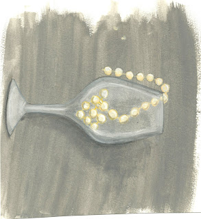
For the Traditional I have started the painting process, I chose to portray a very elegant feel for this design.  I chose to paint an empty wine glass, filled with a string of pearls and the other end dangling outside of the glass.  I chose a grey a background and even created a drop shadow to look more 3D.
This is the scanned painting, after it finished drying.  I then brought it into photoshop, scaled it to my liking and brightened it as well as removing some of the yellow tones out of it-for a fresher brighter look.
This is the final look.  There are no words on it, as we were just to create the picture.  I used elegance as my inspiration and think it turned out well.  As you see, the greys are now darker, the cup looks 'crisper' and the pearls are whiter instead of yellow.  I'm happy with the painted look as it's the technique I was going for and am pleased with how the entire label turned out.


Thanks
Veronica K

Tuesday, March 13, 2012

'Emotional Labour'


Hello all,

To me Emotional Labour is defined as communicating and connecting with other people even if you aren't in the mindset or mood to do so at that very moment.  Godin, in his podcast, shared a story that makes  sense, and makes you think.  He said that one person said they felt sorry for flight attendants because they have to be nice to you and have a  smile on their face even if they really don't want to if they're angry, sad, etc.  If you think about, that is life on a day to day basis.

 In the customer service field, where I work, you have to interact with managers, co-workers, and customers on every shift.  A lot of the time, customers can be unhappy because of something that happened to them during their day, which makes them seem like they are angry at the world and they take their frustration out on the associates of a store.  I've been in that position plenty of times, and think "Oh my gosh, they're being so rude, so mean to me for no reason - I've done nothing."  This then gets me angry/upset and to the point where I don't want to talk to communicate with anyone else because now i'm frustrated.  You can't act that way though, you have to be kind, and helping and say "Have a good day" even if, in that moment, it kills you to say it!  It's part of the job, and you chose to be a part of that when you signed up for it.


I follow a few blogs  of people that I think do a really good job of promoting 'emotional labour.'
Most of the blogs I follow are by 'famous' Youtube beauty gurus as it is a big community on Youtube and something that I'm very interested in, and keep up with.

Marlena's Youtube homepage


The first one,  and the one that I've been following for quite some time now is a blog called 'MakeUpGeek.'  It's owned by a beauty You-tuber, makeup artist and now a cosmetic brand owner, Marlena.   I like her blog because it shows the videos that she's put on youtube, contests, giveaways, and her products that you can purchase and try for yourself.    The biggest thing I like about her blog though, is that she has these "Weekly Challenges" that you can do where she finds an inspiration picture and you have to create a makeup look using that.    She creates 'polls' on her website called 'Have your say' where she asks you a question about anything about products, etc and you get to vote.  Youtube is also big for her because she asks people to request ideas to her,  it's more of what the viewers want to see, and it's step by step tutorials to help people learn what she knows.  It helps her connect with her viewers from Youtube and her loyal subscribers/ followers of her blog and lets her know that people are actually looking to her for inspiration, and getting to know the real Marlena, which in turn, gets her 'return customers' and more subscribers, making her more in demand.  I don't generally go to the blog to see Marlena though, I go because I like what she posts, and I'm genuinely interested in what she says about products, when she mentions new products, and on her youtube when she does reviews on them.
Click here Marlena's Blog!


The last 'blog' I follow is more of a community blog.  It's called Pinterest.   You make your own account- which is free, and you go through different categories of your choice like Your style, Beauty products, photography, find pictures, or sayings that you like, and 'pin' them to your wall.  You can share this page with other people, people can follow you and you can be in the loop with each other.  It's actually really cool, you can also comment on each others posts and re-pin their items to your wall if you liked it so much.  This way that particular image or saying is sent around to a bunch of people connecting us in some way.  If you know people and they start using this, you can engage in building a friendship by talking to each other and because you have things that you both like thats more things in common with that person.   It's really interesting and you get to see everyone else's inspirational pieces, and build from that.   This website does not offer you any free gifts or what not, I mean, if I could have what i re-pin for free then I'd be super happy! but it's not about that.  This website is like an online 'inspiration board.'  Those boards that people make and hang up with inspirational pictures of what they want at some point in their life, whether it be a sports car, that dream home or things as simple as a dress.


The last 'blog' I will be talking about is more of a Vlog (video blog).  The ever famous and popular You Tube.  Now, over the years, I've come to the realization that I've learnt A LOT from youtube, and have a slight addiction ...okay more so then slight, I have a big addiction but good reasons!  I am 'subscribed' to quite a lot of Youtubers, from Singers, to comedians, but the category that takes up the most of my subscription list is the beauty department.   I, like many other people, watch makeup tutorials to learn specific skills, and specific make-up looks that I wish to achieve and the way that these women/ young adults explain things really help.  As a visual learner myself, I like to rely on these videos because it actually sinks in to my head and I remember them a lot more then if I were to just read something and be done with that.  These girls also give product reviews on things they bought or if a company sent them something to try out.  They let you know the good, the bad and the ugly.    Most of the time, a lot of the more popular beauty gurus even have giveaways and contests.  To get more looks, they even collaborate with other youtubers. The girls don't have to do these things for people, they choose to upload these videos because this is a hobby of theirs and they know other people want to learn certain techniques, or other things so they upload for our enjoyment.
Some youtube beauty Gurus also have vlogs, which is a video compilation of their day, which gets lets you get to know the real person behind the camera.  The people I follow, i know are to be genuine and usually say that they spent a whole day filming tutorials because they wanted us to have something to watch from them.  They genuinely care about the viewer and take time out of their days to set up a space with good lighting, etc, record this video, edit and upload.  They try so hard to please the audience when they have a life outside of their computer.  A lot of these youtubers have also made partnership with Youtube because they cared so much and got a lot of viewers and subscribers and worked so hard to please people.  They really do understand what emotional labour is.
Youtube Homepage


Click here to Go to Youtube

Overall, in summary, Online media has become a big part of the 21st century and has even become a part of my life, and will continue to do so.  People will continue to use sites like the ones mentioned above and this will even start a lot of new jobs, and job opportunities.  The people that will go further in  the future with these jobs are the people that take the initiative to actually start up a blog, or website. Once being a part of the community, they will start to understand what emotional labour is, on a personal level.   The people of these communities truly do a lot of work in their day just for us, that we won't fully understand until we take the time out of our own days to do what they do.

Thank-you
Veronica K

Monday, March 5, 2012

Daily Dose of Fluid?- Illustration Friday

Hi All,
As stated in my previous blog, the next word For Illustration Friday was 'Fluid.'
As soon as I heard this I (sticking with my make-up ad theme) thought of Liquid Foundation, so I got straight to work!
I started with going into illustrator and remaking a bottle of 'foundation' and brought it into photoshop.  I then used a large brush to make it look like 'streaks' of foundation across the canvas. This would later be used as the base of the image.


I really like the ads for Sephora, they're really fun, so I created ANOTHER advertisement for them!
At this point in the ad, I added the Sephora logo and the font/text I wanted to use for the word 'Fluid.'
I placed in in the direction of the 'foundation streak' and added a drop shadow in a darker shade of 'foundation.'

As always, I came up with some quirky little saying  that says "Your skin deserves a little 'splash' of liquid beauty" and mentioned that it's a new line in the brand, to clearly state what I'm advertising, if you couldn't already see it.   

I wasn't particularly 'inlove' with the saying, I wanted to make it more 'clever' and to have better synergy with the actual word 'Fluid.'  So, i ended up making it a  question, that makes it sound like it should be H2O... Are you getting your daily dose of? Fluid ... Just a clever little pun! I also changed the placement of Text for the question and the ' A new line..." text as I didn't like where they were and wanted the saying to stand out more, and differ from the other text.   I ended up putting the saying on an angle, the same angle as the foundation streak so that it went well with Fluid, and kept the other text clean and straight so that it was clearly visible.

I liked the placement and decided to add a white soft drop shadow to the saying as I wanted it to overlap the fluid streak but not blend in.  I also last minute noticed that the saying looked odd having a question mark before the word Fluid, since it's suppose to be like the ad is asking you if you've had your daily dose!
Alright, after much consideration, this ended up being my Final!
I like the way it ended up and glad, that I chose to edit the things I did.  It looks better with the question mark smaller, after Fluid, so the 'question' actually looks like a question.  I am also thrilled about the fonts I chose and how i placed them, it looks fun, but simplified.  
Hope you all enjoy!
Until Next time ... 
Cheers
Veronica K